As part of a master brand campaign, Iglo Group, UK, moves into the next phase of its “The Food of Life” campaign with the launch of a new logo and packaging  across its entire Birds Eye portfolio.
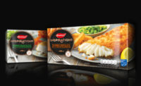
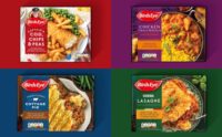
The brand re-launch changes the view of frozen food from “fall back” to “first choice.” Designed by JKR, the redesign aims to bring greater warmth and personality to the brand’s portfolio.
For example, the Birds Eye logo was paired back with a clean and advanced-style look that lends itself to being viewed on-screen—a key consideration given the brand’s increased focus on digital marketing and e-commerce.
The new packaging features the logo center of pack to ensure clear standout on shelf. Updated photography brings products to the fore, showing food as it is eaten and enjoyed in a real kitchen setting.
“Our new packaging completes the update to our master brand and reflects our popular ‘The Food of Life’ campaign,” says Cheryl Calverley, general marketing manager. “The refreshed packaging will help our products stand out on the shelves as well as deliver in increasingly important digital environments.”
Iglo Group will also be revealing information relating to their sustainability vision and forthcoming programs later this year.