Stew Leonard’s, a Norwalk, Conn.-based grocery chain, partnered with branding firm Little Big Brands, White Plains, N.Y., to unveil a fresh new look for its milk portfolio.
The assignment itself focused on enhancing and strengthening the overall look and shopability of the dairy section, without losing personality and charm.
“Stew Leonard’s stores are very unique, as the majority of products are the Stew Leonard’s brand, with very few national brands throughout the store,” says Pamela Long, partner, Little Big Brands. “So, it was absolutely essential for us to spend quality time in the stores themselves walking the aisles, understanding how the brand was being used across its many different categories, so that we didn’t create work in the dairy aisle that designed us into a corner elsewhere. We needed to know the work could live long-term and extend in myriad ways if successful.”
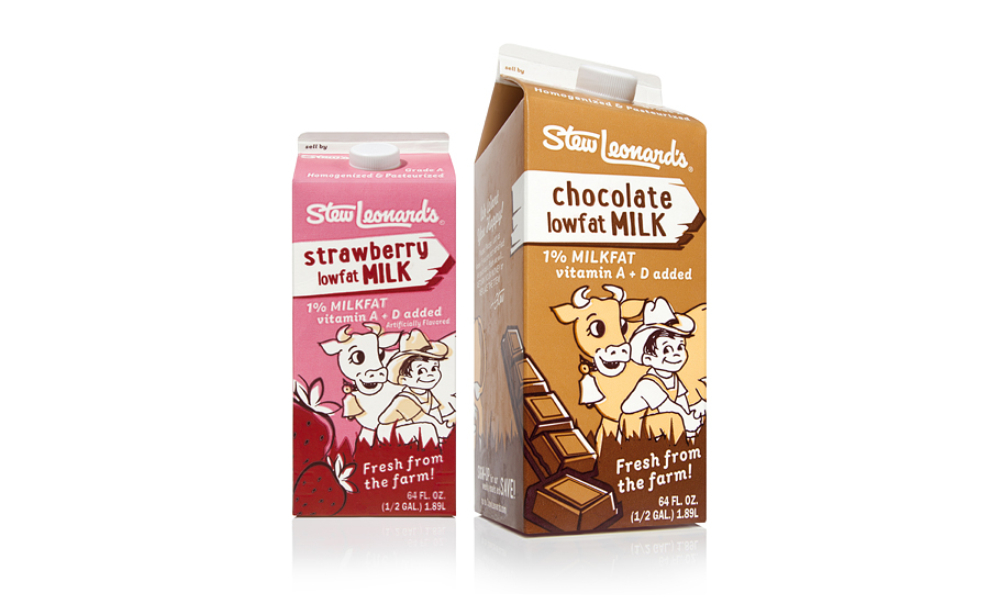
The final design on shelf is a thoughtful evolution of the brand, continuing to evoke pride, heritage and the brand’s playful quirkiness. The “Boy and Cow” illustration synonymous with Stew’s received a slight cleanup on pack. A large woodcut billboard is locked up with the brand across the top of pack to clearly communicate the product type, with strong color-coding supporting this new and improved shopability. Claims and support copy were kept to a minimum, which helped the overall look from feeling too rigid or contrived.
The new design and architecture has also been incorporated into Stew’s yogurts, ready-to-drink beverages and ice creams, with more products being added all the time.