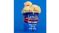
Jeni’s Splendid Ice Creams, Columbus, Ohio, introduced a bright, new and improved packaging design that features a larger logotype and shares the unique story behind each flavor right on the pint.
“As we have expanded our reach beyond scoop shops and onto grocery store shelves, we’ve come to realize we need to be ever bolder—to not just tout our flavor names and ingredients loud and proud, but the name of our company as well. The instant you see our pints through a freezer, you should know it was made by Jeni’s and a little bit about what’s inside because, let’s face it, what’s inside is still the most important thing,” says Jeni Britton Bauer, founder and CEO.
In collaboration with lettering artist Jessica Hische, the bright, colorful pints feature a new, slightly tweaked and enlarged Jeni’s logo on the front, so they’re easier to see and recognize on the shelf.
“Every flavor we make tells a story. It inspired by art, culture, history. Takes hundreds of people working tirelessly to bring it to life—family-run dairies, farm partners, our R&D, sourcing and creative teams. Our pints should capture and celebrate these stories,” says Britton Bauer.
The new designs showcase the flavor name—each of which has a unique, handwritten script in a nod to the original plastic pints—and descriptions on the front. Each pint also includes the flavor story on the side, with the ingredients printed large. Additionally, the flavor names and descriptions also appear on the tamper-resistant safety lids, so the pints can be merchandised in traditional freezers as well as chest freezers at point-of-purchase.
Every pint has a two-color palate with a few exceptions—pints that have two flavors inside receive a 2-color treatment featuring a diagonal stripe; Jeni’s heritage flavor, Salty Caramel, received a unique treatment in the signature Jeni’s Pantone 172 Orange.
The new packaging will begin with seven flavors, and will be on shelves in late November with more flavors rolling out the first quarter of 2018.


