ARCTIC ZERO Unveils New Look for Fit Frozen Desserts
ARCTIC ZERO, the San Diego, Calif.-based pioneer of Fit Frozen Desserts, unveiled a vibrant new look. The elevated packaging puts a spotlight on the brand’s 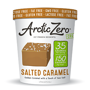 premium ingredients and indulgent offerings, featuring a refreshed logo, updated flavor names, descriptions, hand-drawn illustrations, original typography and organic, earth-toned colors. An emphasis has also been placed on each product’s core attributes with specially-designed badges, as well as attention-grabbing lids and side panels that are artfully filled with unique drawings and bold phrases to call out each product’s flavor and dietary profile.
"As a team of avid ice cream lovers, we’ve perfected our Fit Frozen Desserts to truly satisfy every sweet tooth, and wanted the packaging to more accurately reflect our commitment to clean ingredients and passion for handcrafted, zero-guilt treats," says Greg Holtman, founder. "Our mission was to provide consumers, including those with special dietary needs, with the highest quality ingredients in a delicious product that satiates on all levels, and we feel our modern makeover perfectly matches the excellence that’s inside."
Looking for a reprint of this article?
From high-res PDFs to custom plaques, order your copy today!

")