Tillamook Completes New Packaging Design
Tillamook County Creamery Association, Tillamook, Ore., completed a packaging redesign project for its full line of dairy products, including ice cream, cheese, 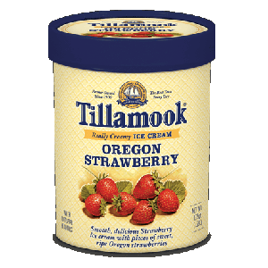 yogurt, butter and sour cream. The redesign showcases the Tillamook farmer heritage, its variety of dairy products and key messaging to convey the premium quality of the brand, while unifying all categories through color and design.
With the new design comes more product information, increased farmer-owned identification and improved flavor descriptions, as well as playful messaging in line with the brand’s character.
“We want to stay fresh and exciting for our existing customers, and we also want to create interest with our packaging to start relationships with new customers,” says John Russell, senior director of marketing. “This update marks the first time the brand has changed their packaging in over four years.”
Tillamook hired Portland-based design firms Sandstrom Partners and Flint Design Co. to tell the Tillamook story and unify all five dairy categories through the new packaging design.
Additional features include information explaining what “Tillamook” means as well as invitations for consumers to visit Tillamook online for recipe ideas and to learn more about the brand.
Looking for a reprint of this article?
From high-res PDFs to custom plaques, order your copy today!

")