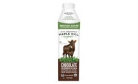
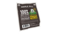
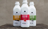
Maple Hill Creamery, Stuyvesant, N.Y., unveils a complete re-brand for its line of 100% grass-fed organic dairy products. The new logo and packaging provides visual uniformity for Maple Hill Creamery’s cream line, drinkable and Greek yogurts, along with its 100% raw milk cheeses and recently launched Kefir lines.
Maple Hill Creamery’s new look elevates the 100% grass-fed brand message, while creating appetite appeal and stronger shelf presence, so the packaging more closely aligns with the artisanal quality and distinctiveness of the product line.
“When we launched Maple Hill Creamery in 2009, we knew we had an incredibly fresh and distinctive product that was different from any other yogurt, and in just a few years we became one of the fastest-growing dairy brands in the natural channel,” says Tim Joseph, founding farmer and CEO. “Our mission now is to bring 100% grass-fed dairy to a broader market of consumers. As we grow our presence at retailers both in the natural and conventional channels, we needed to evolve our packaging to be competitive on-shelf yet remain true to our heritage and mission.”
Some distinctive changes on the new packaging include:
- A simplified and cleaner company logo. The Maple Hill Tree still appears on the container, but not as prominently.
- Bolder messaging about the 100% grass-fed and product (e.g., no added color, thickeners or gums, just 100% real ingredients.)
- Original flavor icon artwork. For example, Wild Blueberry products will depict a fresh blueberry nesting into a bed of meadow grasses, with the flavor name and other copy highlights in blue type. Maple flavor features a maple leaf and syrup nesting in grass with accents of maple colored text.
Maple Hill Creamery’s rebranded packaging should appear on store shelves this May.


