SeaPak undergoes packaging redesign
The refined look stays true to SeaPak’s classic image, marrying the brand’s iconic equities with that of the attributes in communicating its real food ingredients.
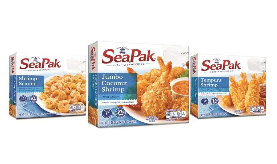
SeaPak Shrimp & Seafood Co., a St. Simons Island, Ga.-based division of Rich Products Corp., revealed a packaging design on its portfolio of 30-plus products.
SeaPak hired Voicebox, San Francisco, to redesign its logo to better align the brand with its message of allowing busy families to “chillax” and escape the stress of meal time with nutritious, easy-to-prepare seafood.
The refined look stays true to SeaPak’s classic image, marrying the brand’s iconic equities with that of the attributes in communicating its real food ingredients. To separate SeaPak from others in the competitive frozen seafood section, Voicebox positioned the products on a nautical-themed white plank background with light blue accents. A more current font style further exemplifies the brand’s history of providing quality, great-tasting, responsibly sourced seafood for nearly 70 years.
“Voicebox’s substantial experience helping larger, well-established, high-quality brands refresh and reinvigorate their packaging made this process easy and fun,” says Kristen Beadon, marketing manager at SeaPak. “We are incredibly pleased that Voicebox’s new design allows SeaPak to break through the clutter of the freezer door, uphold and communicate our key brand benefits and is flexible enough to apply to new product additions.”
Looking for a reprint of this article?
From high-res PDFs to custom plaques, order your copy today!

")